Windows 10 - its doesnt suck?

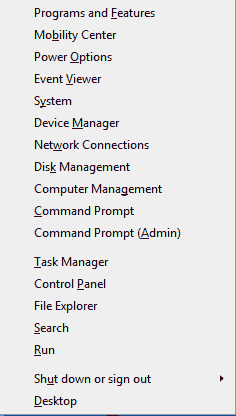
Hidden Start Menu in Win 8
That's How much M$ liked the start screen
I like everyone with the power of choise, am still on windows 7. This is because I hate windows 8, and before anyone asks its not just stick in the mud sulking. I've seen enough of it at work, I've compeletely built an old laptop, this one actually to run it, and then to run 8.1 and tried to live with it for a week. I know how to use win 8 I just don't like it. Who would. the start screen sucks its impossible to operate at all in remote desktop - which as support I frequently do (server2012). Its just bloody awful. The proof of the suckyness of windows 8 can be ilustrated by pressing Start+X on your keyobard.
I've installed windows 10
Now early on In win 7 I was quite critical, it crashed a lot and I couldn't get drivers for it, see this and this post, now I just crashed win 10 - trying to save a file to a stub network via hidded c$ share from Jasc, (remember them) Paint Shop Pro 9. Yes a program that will not even run on Areo. So I don't think I can critisise it there.
TRIVIA: Why Ten? Rumor has it that there are lots of programs out there that begin with code that looks at the beginning of the windows version to see if its "Windows" I.E. Win95 or 98, or "Windows NT", code like if(versionBegins=Windows9) then { the result is windows 9 would be mistakenly idenetifed as windows 95/8. So they skipped to 10.
Bloody hell its fast. This laptop is a mid 2011 ish, first gen i5 with a Sata II SSD in it, yeah nice but hardly cutting edge. It had one careful owner and one un-carefull owner, me. Its been coffee'd turned into a hackintosh, had bits of its hardware swapped, its 3g card is in a jar on my desk. The left mouse button is decidedly soggy with use, the track point is bald. However its flying along under windows 10, it may be part window animation speed, but everything is near instant.
Windows 8 may have been fast as well, I've never been able to tell, the GUI is so goad awful you never get to do anything in a hurry. Windows 10 brings back the start menu, which means you can hammer the start menu button in the time honored way and fir up programs quickly then Alt tab between them. Even the fucking useless windows store apps run in windows, so when you accidentally (nobody would do it on purpose) launch one of these you can [X] out of it and alt tab still works.
the M$ feedback nagger cuts in at this point and asks "how easy was it to Alt Tab" I answered Fuckin Easy, in the how of encouraging them.*
Improvements?
Well, its not windows 8? Ok seriously Multiple desktops, workplaces if your used to Linux, now when I used linux more, I loved multi desktops. Back then it was because it was worth re-arranging you windows so you had workspaces.
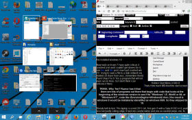
Microsoft windows apps usually end up as full screen until win 7 the window manager was pretty ropey for small windows. But sometimes I end up like my linux days with a whole bunch of tail windows and scripts running at the same time then arranging them in a desktop and the workspaces and the snap windows to corners thing is going to work for me in the same way the killer feature or Win 7 is that half screen windows snapping. In win 10 its been tweaked - if you snap a window to half screen then it officers you a list of windows to snap to the other half. neat. Hope this works on multi monitors.
Well how do you exit out of a shell script or program? CTRL + C I wonder if that still works? Why do I ask, because if you drag a box with the mouse over the command prompt it draws an normal selection and Cut/paste works. Nice. and 20 years overdue.
So were at 2 features I might actually like, that's a lot for a new version of windows.
Couple of things, its garish and soulless at the same time, the windows have a huge, well its more of a blur than a drop shadow, around them, to try and give depth, doesn't really work. The start menu is shockingly garish everything else is understated. Scrollbars are so stylised and minimalist grey its hard see where on the page you are. You long for 3d styled anything. Right up till you hit start and search where unreadable cyan text on light blue with garish icons , icons selected for misplaced minimalism rather than practical identification hurt your eyes.
* Please note, Windows 10 preview sends EVEYTHING to M$ - be aware of the privacy implications.
