[BLOG ARCHIVES]
a new hope fades, I am so learning osx
Windoze 10 (so named so it doesn't get mis-detected as window 95/98), Well there's no way to hide it, its not remotely ready yet. OK so the start menu is back. well done start menu. Unfortunately its stuffed full of Mr Blobby tiles. Yes my previous optimism has evaporated.
I was a walking in JB Hifi today, and I was struck by the lines of windows machines, mostly sitting on the windows 8 horrible start screen, now I know I said windows 7 was ugly, many moons ago, its grown on me, I've been seeing windows 8 around for a while now. Those icons have NOT grown on me. Nor has the horrendous clashing colours, cyan one of the original 3 CGA colours always made me sick. Its a colour not found in nature, a colour not even a mother could love. I just googled 'logo", there's light blues sky blues and every other hue, but nobody and I mean nobody would use a cyan only logo. Fugly, garish and designed to launch apps with no functionality that even a mobile phone user wouldn't use.
Contrast the windows business machines next to the macs yes, the macs with their generous screens with neat menus and multiple windows. Its no wonder windows is struggling. I mean M$ has never had taste, still doesn't, but flick your eyes from windows 8 to osx - which one looks professional and capable of doing useful work.
 Contrast the windows business machines next to the macs yes, the macs with their generous screens with neat menus and multiple windows. Its no wonder windows is struggling. I mean M$ has never had taste, still doesn't, but flick your eyes from windows 8 to osx - which one looks professional and capable of doing useful work.
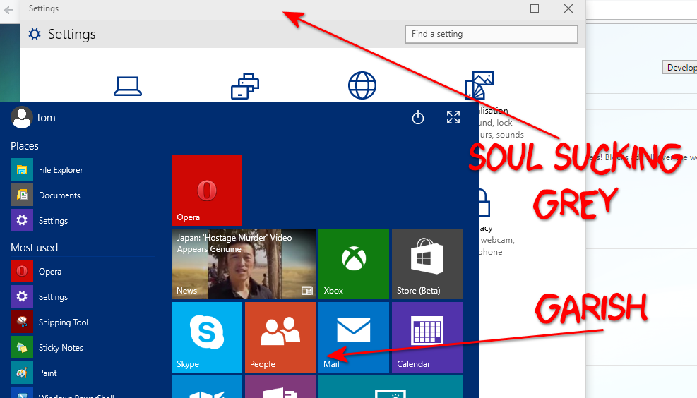
Now windows 10 brings back the start menu. well sort of, its half start menu half Mr Blooby tiles. I suppose these active tiles can be likened to apple's dock with its notification and bouncing windows. Whatever I said back in 2009 about windows 7's garish transparency, well it got turned down a bit by release, and ultimately softens the appearance. Windows 10 at present is horrendous. There's violent edges on everything with soul sucking grey for all non-active windows, customising it makes it worse the background dark and you can't read the dark text, light and the light disappears. This is probably partly to do with trying to break the 2 interfaces schizophrenia of windows 8. Rather than have the normal windows environment have its fixed colour scheme its gone and matched the start screen garishness. Its bloody awful.
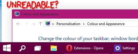
In attempting to share the screen shots for this I had to disable firewall and enable file and print, the wifi app doesn't do it nor does it actually tell you if its connected or not, well not accurately, the win 8 side block of colour appears when you click an old school button no charms now (good), most people seem to be using local group policy editor to do this. The start menu, well most of its full of pointless tiles. No normal user has ever modified their start menu nor are they going to use any of the windows 8 style craps (well not twice). Meaning most of the start menu is wasted. Oh and there's a huge chunk of start screen styles off screen. See if you can spot the scroll bar in the big pic above. It appears in the almost unusable win 8 style of 1% colour difference too late to use. Look Microsoft moving a mouse over a bit of screen whilst moving you head in relation to the screen whilst shading the screen with one hand in attempt to make out the current state of scroll is bloody stupid. and don't think its an accident or part of the preview, windows 8's the same. Check out the scroll bar right, and the colours and margins...
 In attempting to share the screen shots for this I had to disable firewall and enable file and print, the wifi app doesn't do it nor does it actually tell you if its connected or not, well not accurately, the win 8 side block of colour appears when you click an old school button no charms now (good), most people seem to be using local group policy editor to do this. The start menu, well most of its full of pointless tiles. No normal user has ever modified their start menu nor are they going to use any of the windows 8 style craps (well not twice). Meaning most of the start menu is wasted. Oh and there's a huge chunk of start screen styles off screen. See if you can spot the scroll bar in the big pic above. It appears in the almost unusable win 8 style of 1% colour difference too late to use. Look Microsoft moving a mouse over a bit of screen whilst moving you head in relation to the screen whilst shading the screen with one hand in attempt to make out the current state of scroll is bloody stupid. and don't think its an accident or part of the preview, windows 8's the same. Check out the scroll bar right, and the colours and margins...
In short - yes start menu back good, speed, well this build seems slower than that last but OK. Fugly, yes, finished no. Is it going to "fix" windows 8, well no, they've not removed the schizophrenia, they've just shifted the balance point between the personalties a bit.